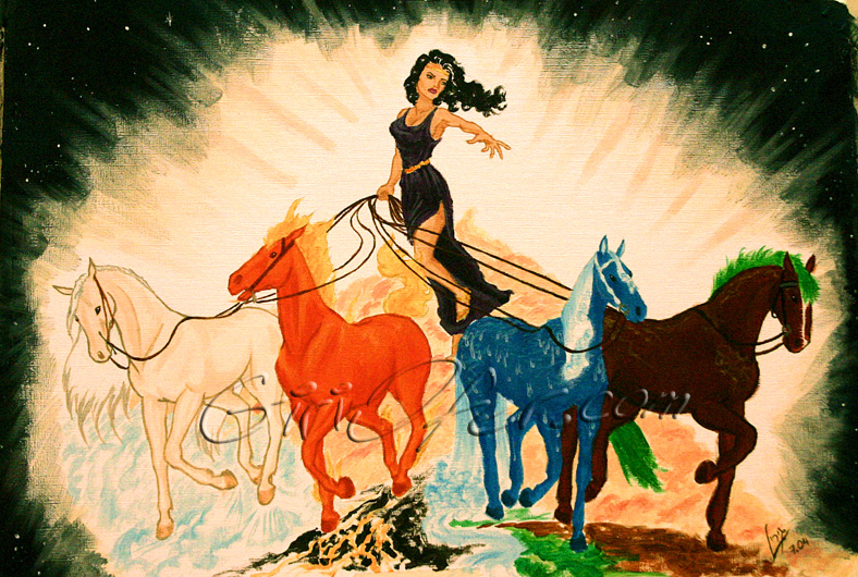
This drawing was done as part of an Internet competition under the subject “the four elements”. Honestly, I think I was just looking for an excuse to paint colorful horses.

This drawing was done as part of an Internet competition under the subject “the four elements”. Honestly, I think I was just looking for an excuse to paint colorful horses.
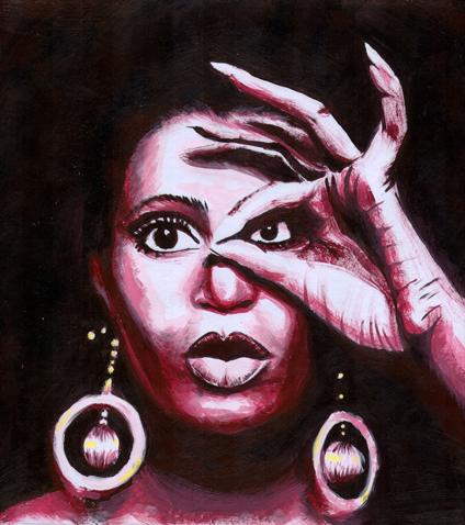
A work I did during my second year in “Minshar” Art college. We received B&W pictures and were ordered to recreate them in a one color scale, with black and white, and “a touch” of an additional color. The yellow touch is barely seen, mostly because I felt it wasn’t needed, and added it only due to the exercise’s instructions. For an artist, I do tend to be sqare and accurate when following instructions.
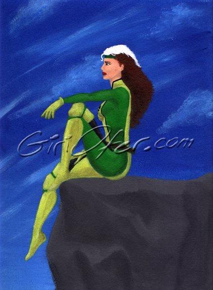
This is a pretty old piece, and sometimes I wonder why did I even put it on the site. It’s not that remarkable. The thing is, one day, I was googling “rouge”, or “rouge x-men” or whatever, and this painting was in the first result page of the images. I think I now keep it on the site for the honor of it only.
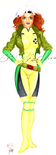
I don’t know why, but whenever I look at this drawing I can’t help but think that she turned out very similar to Geri Halliwell. I don’t even know how true it is, but it sort of got stuck in my head. Actually, this piece had no model, and the face was mainly determined by the combination of a texturized paper and my lack of experience. I find her cocky and sweet at the same time.
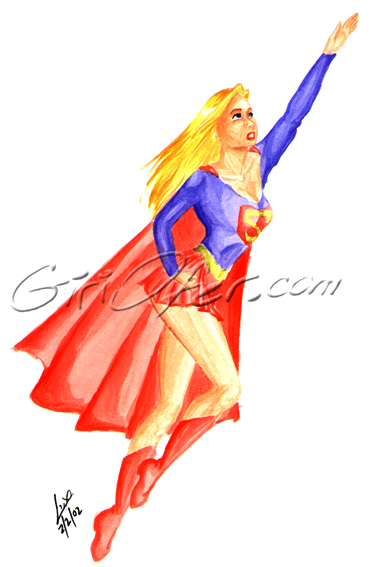
This is a classical “Never leave the face to the end”. I liked it much better before I added the face, though it’s pretty nice now too.
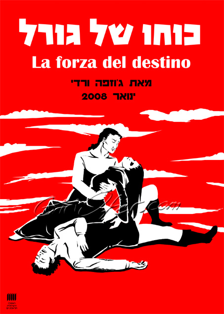
The final project of illustrating course in “Minshar” art college was a fascinating one. We had a class competition designing a poster for an opera and the winner’s design gets to be the real poster of that opera! cool. The opera people said they want something young and different, so after some pondering around, I went wild. Anyway, I assumed it’s more just that someone that actually will make a living from this will win, so I could feel free. The opera is Verdi’s “La Forza del Destino”. By the way, the opera’s people didn’t like it claiming it was “too young and different”. whatever…
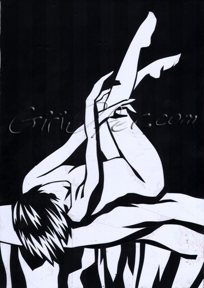
This is a cutout work I did in “Minshar” art college. The technique was very frustrating, since I made such works before in the computer, and making vegetables the hard way wasn’t a good idea in my opinion. The minute we got homework, I asked for permission to change the subject and was happy to at least do something interesting.
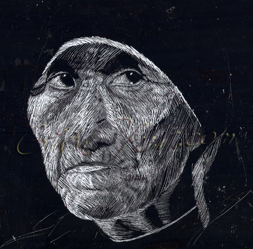
This is a scratchboard work I did in “Minshar” art college. The technique was very cool, though the noise of an entire class scratching made me crazy. I made two pieces and enjoyed it a lot. This was the first work – we had to choose a portrait, preferably an old person, to draw. I like it a lot.
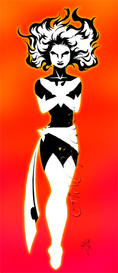
A computer enhanced cutout piece, I couldn’t place on any other gallery. I like it – it’s a nice cutout work – and the digital background gives it a nice twist.
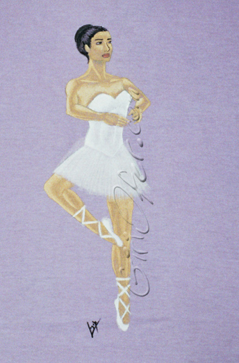
I made this shirt as a gift to a ballet loving friend. I tried to use some transparency in order to preserve the lilac shade but unfortunately that shows better on the real tee than in this picture.
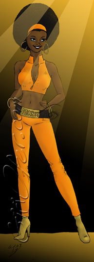
I made this drawing during one Saturday’s time after watching “Austin Powers”. It happens to me quite often that I start sketching something after watching a movie or reading a book. Anyhow, I think she’s adorable, and the only thing that spoils her is the fact that I lost the original file, so I have only the copy with my old watermark to show now. Oh well.
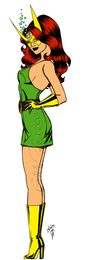
I always thought that Marvel Girl’s outfit was not brought to it’s potential. That’s a tiny mini skirt, worn by a woman we know should be very attractive. I decided to stop with flat colors, because the shaded version just didn’t fit. So, there she is – marvelous, isn’t she?
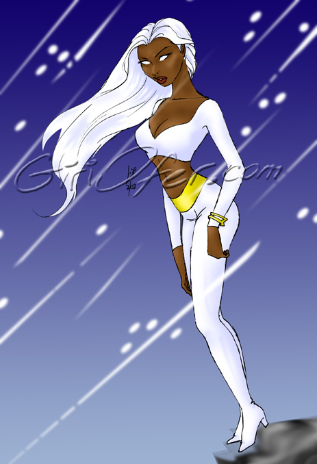
“How quickly can you color a simple sketch?” He asked, and I took the challenge. If I remember correctly, it took me 45 minutes to scan and paint this. Not a very impressive result, but after all, it is cute. Isn’t it so?
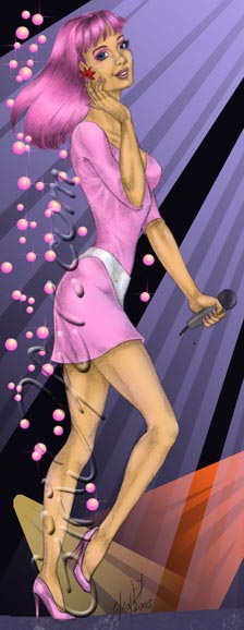
A pencil drawing I made while thinking of painting it. I learned much from it – I’d do it differently today – but I love it anyway. Jem has been a wondrous figure for me ever since I saw the first episode on TV, and I like drawing her very much to this day.
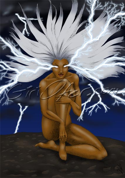
I modeled for myself for this drawing. The thing is, when you sit in front of a mirror, then run to draw, return to the mirror and so forth – you get pretty crappy results. Nowadays I’d take a picture and print it on the spot. Anyhow, I adore the result. Another funny thing is I finished everything but the lightning, and then pondered for about a month how to approach it – finally I just drew it with my then-brand-new Wacom tablet. Storm is one of my favorite characters, and I enjoyed making this portrait of her so much!
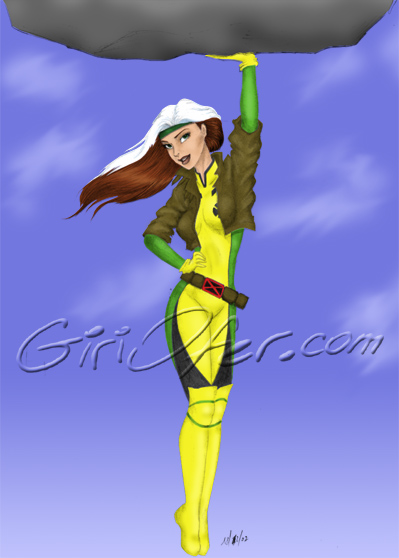
This was my first attempt in coloring a pencil drawing. I like the result a lot. There’s something sweet about that painting – she’s not even cocky as I usually make Rouge but shier I suppose.
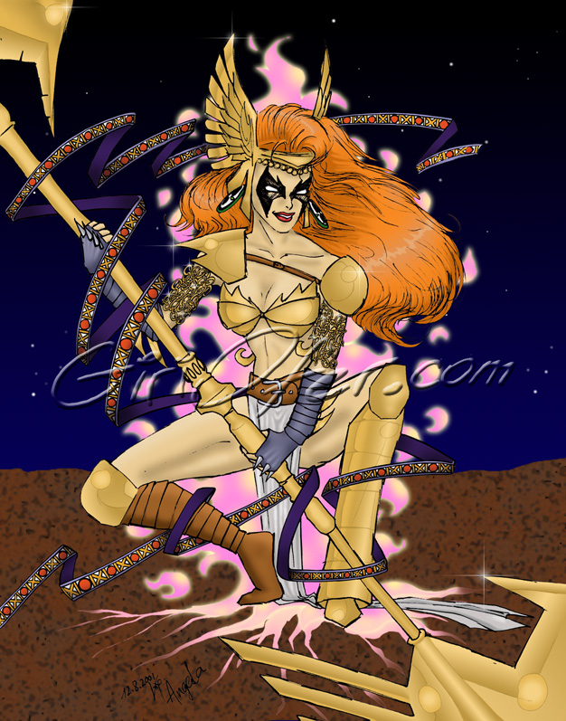
This drawing was made as a sketch on a checkered paper, and the logical thing would have been to copy it onto a clean piece of paper while fixing the many errors it has (and minding all the small detail as well). However, why be logical? I decided I wanted to control the picture process tools of Photoshop better, and decided to learn how to do so while cleaning the picture with the software. It took months! Every time I worked a bit on it, got tired, and left it. Re-drawing the piece might have been much quicker, but this way my picture processing abilities have improved drastically. It’s a fan art of Angela, a character out of the pages of Scott Mcfarlane’s Spawn, I got to know through Aria – the comic book that started it all…
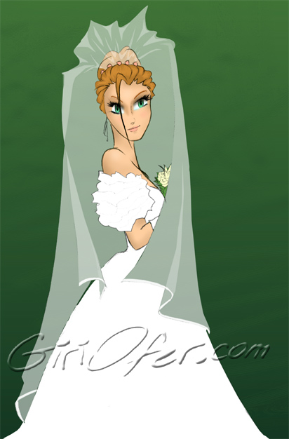
When we got married, we got a present from dear friends who were in the comics business. They made a card with Superman’s wedding, Spiderman’s wedding and cyclops’ and Jean Grey’s wedding, leaving a forth square open for our wedding. I accepted the challenge, but out of the sketches this was the only one I liked. It’s pretty much a self portrait in a Manga like style. It was the first time i had experimented with Manga.
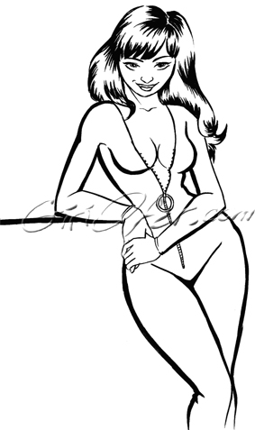
A definite influence of reading Danger Girl (by J. Scott Campbell and Andy Hartnell) in the evening. I didn’t mean to draw Sidney – so it’s not really her – but it’s oh so influenced. Go Campbell go! I like your juicy girls.
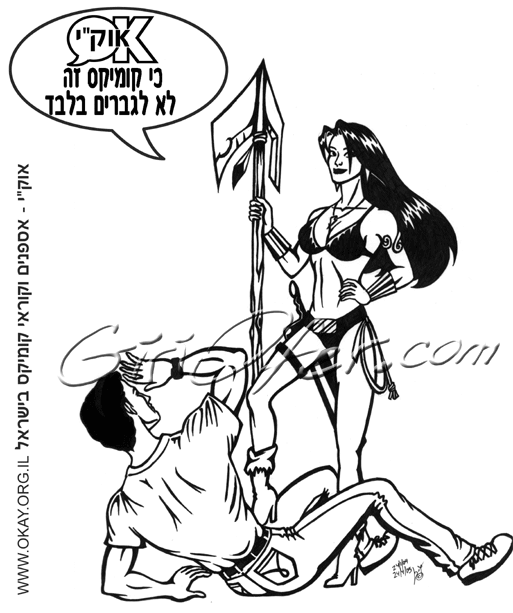
This is the final graphic design of OKAY’s (Israeli comics readers and collectors) first T-shirt (other designs exist on the site). I had to rough it out due to print limitations, and it was a very painful work for me.
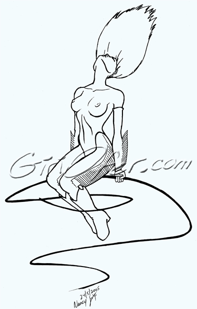
A fan art of Frank Miller’s Sin City stripper – Nancy Callahan. I thought about doing it in B&W cutouts, but it just came out like that. I love Miller’s work on the entire Sin City series.
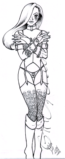
This is a Linsner fan art piece I did in a managerial course. Trying to explain who Dawn was to my course mates was hilarious. I like this drawing because I felt a bit of awe coming to draw it, like: “How dare you draw the goddess?” and it was funny, and nice.
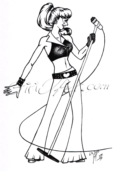
I drew this when I was still dreaming of making a Jem comics one day, and tried to imagine: how would Jem look like in a comic book? I gave up some of the permanent puff though…
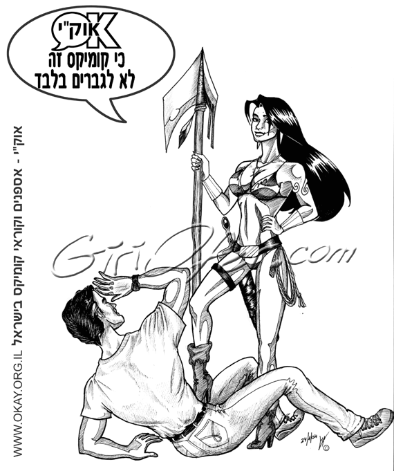
This was a design for a vague idea of a “Comics – not for men only” T-shirt, for Comikaza comics shop. The project didn’t come to be, and I wanted to use it for the OKAY (Israeli comics readers and collectors. In Hebrew these are the initials) T shirt. Unfortunately, I found out I need to thicken the lines dramatically, and the final graphic outcome was something I liked much less.
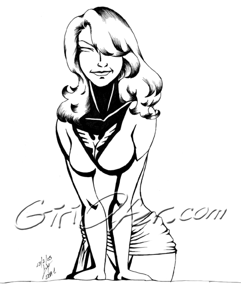
This was a chance to try out a new set of pens. I had no muse whatsoever, so I quickly sketched a leaning woman, put the phoenix uniform on her, and got to the point of trying my pens. I kind of like the result.
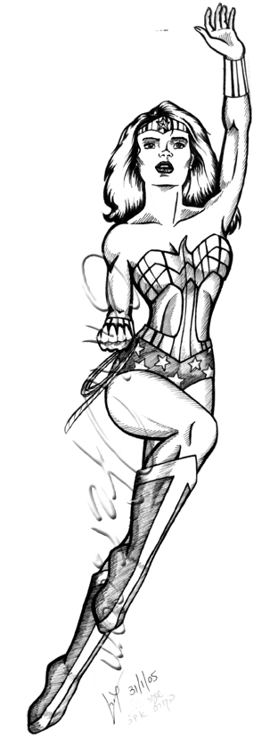
Another boring course. I wanted to draw something practical, that I could paint and sell, so I did this (I wouldn’t buy it though). It’s stiff, but cute, and I wanted it in. so there you go.
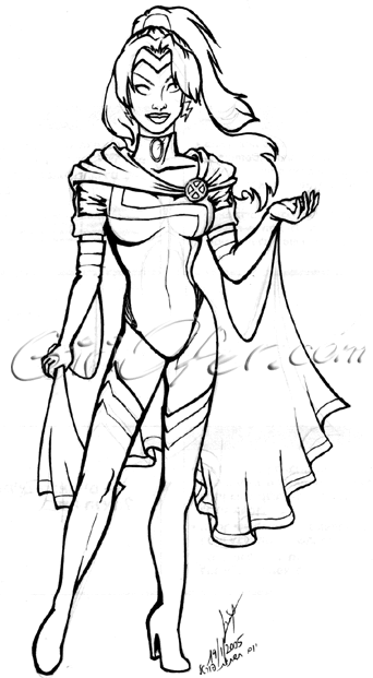
I did this sketch on a lecture that didn’t fascinate me much. It was during my reading of the Extreme X-Men title, and I gotta say, I loved the outfit they gave storm there, and the whole line of art in general. When I like something, I tend to sketch it.
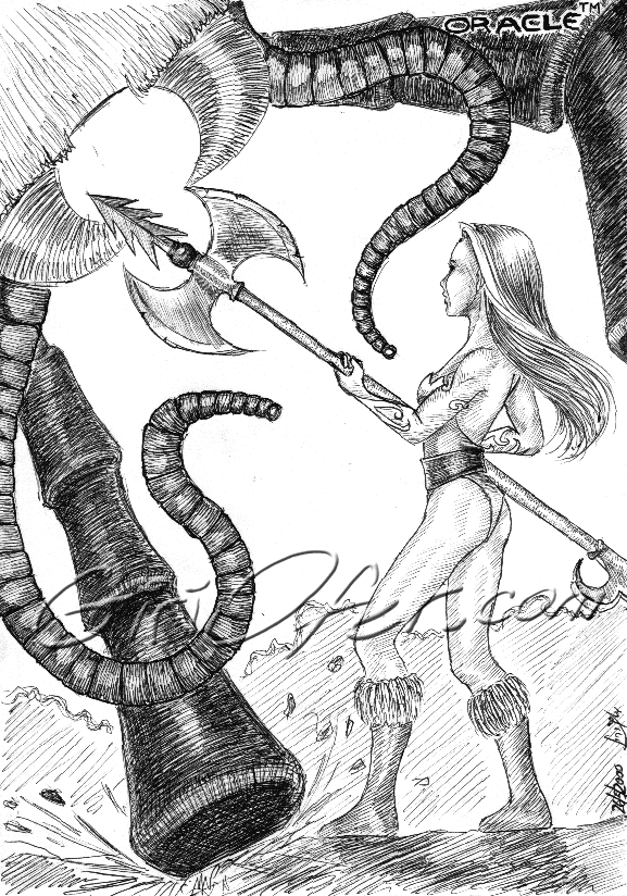
This is an old sketch, done with a simple ball pen. At that time I was a programmer in my first project, we were migrating from the old version of the development tool to a newer version, and I felt like I’m spending most of my time fighting Oracle’s bugs. So I drew this. The DB team liked it a lot.
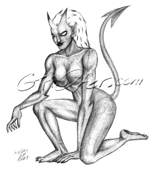
This piece was made during my first DBA course, as I felt that even an interesting professional course would be a waste if I don’t draw anything. Can’t say she’s amazing, but that’s really the lecturer’s fault; couldn’t he be a little more boring?
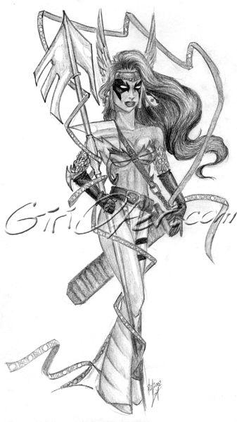
There was a time when I drew Angela whenever I felt angry, impatient or put down. It’s been a while since, and this is not a very typical sketch from that time, but that’s a nice story. When I was upset, my Angelas would be furious, and usually crouching in a very threatening position, unlike this calm model here. Still, I like her.
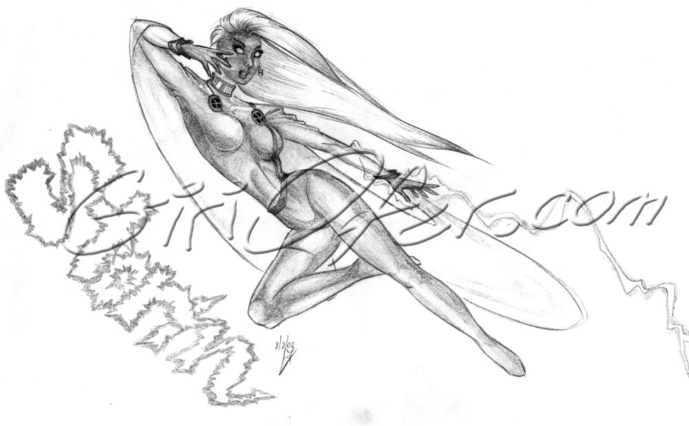
This drawing is one of a series I made for sale on a small yard sale of comics, when the biggest comic-con in Israel wouldn’t include more than twenty people. Ah, the good “comics world” days… Anyhow, most of them weren’t sold, and I couldn’t bear to sell them later when people were interested, so I still keep most of them around.
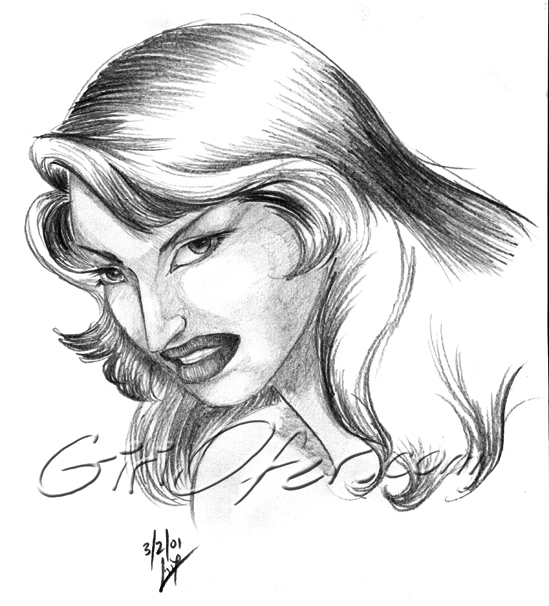
This face was supposed to be angry. Well, I got better with time. Anyhow I like it, and not less do I like the tribal copy, that got the name “Vampirella” by my husband. Go figure why… LOL.
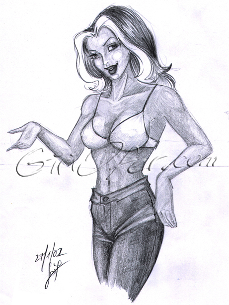
Well, actually it was a plain “girl on the bar” gig that I felt i wanted to put a little more into, and I just left her forehead hair white, so… Of course it’s rouge. She’s good looking, sassy and had a white lock of hair. What? She’s not dressed enough? Well, petty people, you’ll just have to make do.
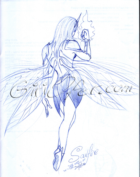
Software’s development status discussion. These can sometimes be a great ground to grow sketches on, since you have to be in the entire discussion and participate actively in a small part. I made this with a ball pen. The late Michael Turner’s Soulfire title was a great hope for me, because I like fairy tails and there aren’t to many of them to come by. The publication delays drove me crazy though.
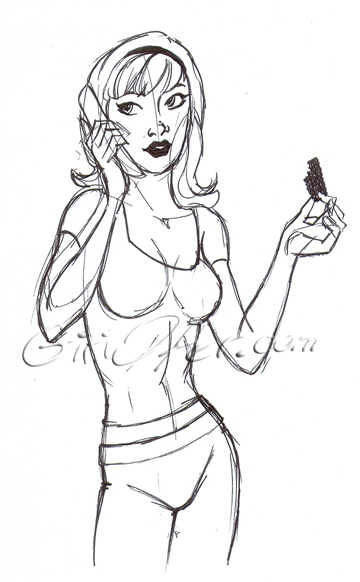
I tried to justify drawing a woman in the middle of a men-sketch-rave, so making it sort of a caricature was a way to shut my conscience. I think she’s adorable.
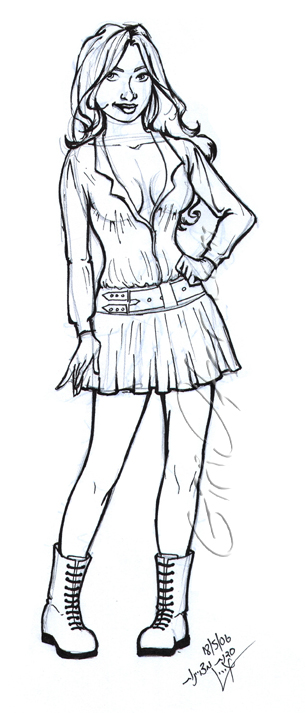
If I’d delete the pencil marks and clean the visible stains from the other side of the paper, this piece can be ready to be painted. Maybe I’ll do it one day.
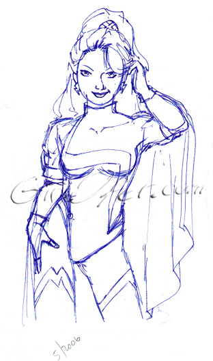
OK, she’s a bit teasy, but she really was in Extreme X men. I liked the outfit and art there a lot and enjoyed sketching it several times.
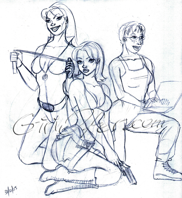
I LOVE Campbell’s Danger Girl. The girls are so… juicy! I sketched Abby without thinking (or intending to do her) and then decided to add the others, for the fun of it.
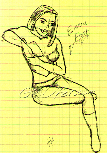
Just a typical woman sketch I decided to turn into Emma. I’m not sure why. I like it even though in the comics she’s always a slim, cold bitch, and here she’s more round.
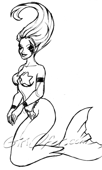
An old sketch I just like. I don’t remember when I made it, but it’s nice in my opinion. Mermaids are one of the things I get to sketch if I don’t pay attention to what I’m doing. I even made several versions of illustrating “The little mermaid” for the world’s greatest publisher – the drawer.
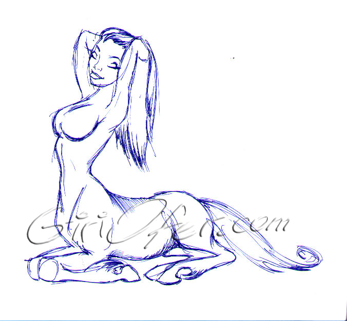
Another typical female centaur sketch that I love oh-so-much. It’s sort of a sketch that says : “ahh… Life is good”.
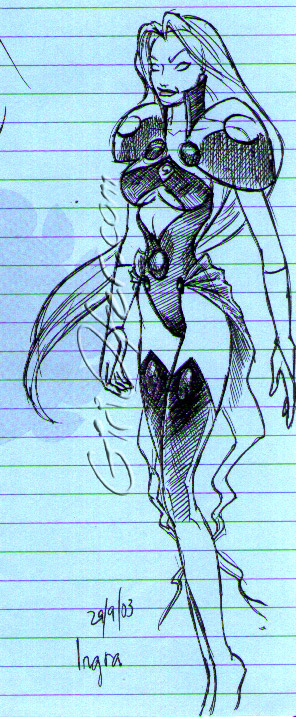
I made this during a discussion the day after I started reading Crossgen’s “The First” comics title. I didn’t remember Ingra’s image exactly, but this sketch captures the idea of her, more or less.
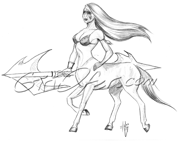
A typical quick sketch of a female centaur. This is something I could do in any given discussion, lecture or phone call. One of the default subjects for me.
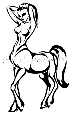
This is one of my favorites. I think it has a lot of flow in it. Besides, it’s my two favorite drawing subjects combined, so what could go wrong?
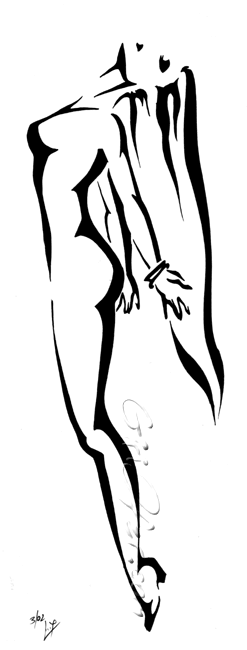
One of my favorite tribals. I was thinking about X-men’s Storm when I did it. The sketch was kept as is, I just filled it in with black to try and keep it free and simple. I think that came out perfect. Sometimes I feel the flow and movement get lost in the final piece – here it didn’t happen.
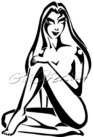
I’m not sure what this was about, but hey, I like it. By the way, it’s among the first cutout drawings I did.
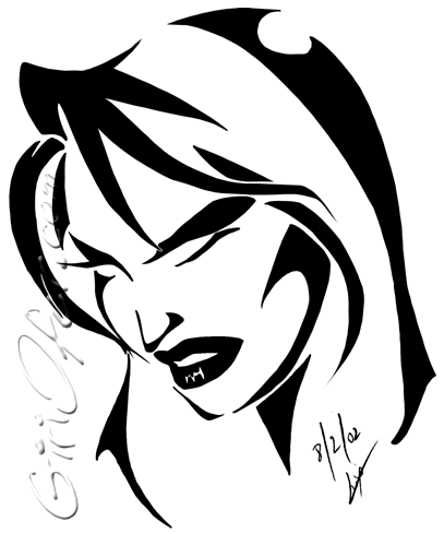
I did this with pencil and my husband asked me to try and “tribal it up”. A simple yet strong tribal, that he decided to call “Vampirella”, god knows why.
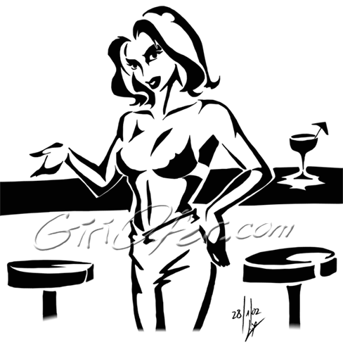
A tribal version based upon another pencil drawing I did. Ofer liked it and asked me to process it into a tribal. Looking at it now I feel there’s more to fix than keep, but it’s nostalgic, so I’m keeping it.
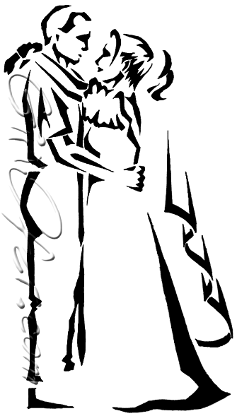
This is the fore graphic of our wedding invitation. We posed for it in a picture, which was terrible. I didn’t even use the reference picture because it was fuzzy and smeared. I liked that invitation a lot – though if it would have been less expansive, I would have printed it as white on black.
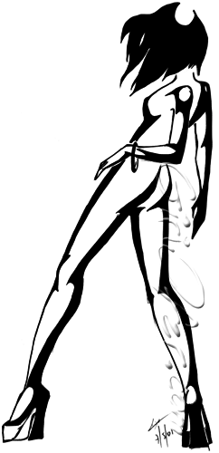
This is one of the first, if not THE first, cutout work I did. It’s small and simple, but I like the movement in it.
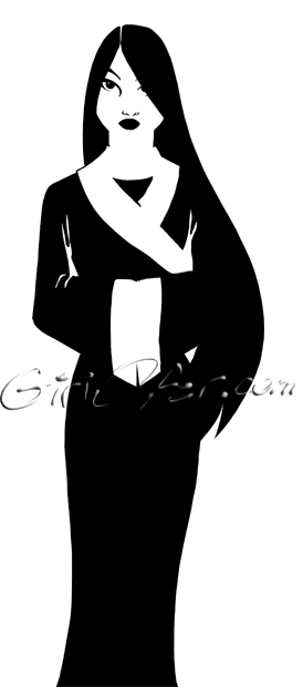
I think this piece is something of an external influence, though I’m not sure which. I just sketched it and thought it could be a nice cutout piece.
![]()
When I got released from the army, I made printed glasses to the closest people I was stationed with, as a gift. There were two friends of mine that nothing I had in the portfolio felt like it would fit them. So I did this tribal thinking about them.